Frustrated at not being able to find what I want in t-shirt designs, I've started to make my own. So far I've used Cafepress and Zazzle to make the shirts. Cafepress is a little more expensive and takes more processing time - Zazzle costs less and arrives faster.
In the photo to the right, the Cafepress shirt is on the left and the Zazzle shirt is on the right. I've already worn and washed the Cafepress shirt in this photo (which explains the wrinkles) while the Zazzle shirt is straight out of the mailbox.
You'll notice that the design on the Cafepress shirt is narrower. I ordered that shirt first and did not realize that their maximum width (10") does not go entirely across the front of the shirt. This is unfortunate as that is what I wanted.
So I widened the design by adding more leaves and spreading the surfboards out more and sent it off to Zazzle, which allows up to 14" wide designs on their shirts. I received the shirt on the right from Zazzle. Not entirely happy with my design yet, as spreading out the surfboards exposed blank spots between the leaves. I'll fix that if I have another shirt of this style made.
Other changes I made: I changed the color and fuzz level of the blue leaves, I used the exact same surfboards and yellow flowers on both shirts, so we should be able to compare those elements directly. Let's do it!
Cafepress uses Haynes shirts. I ordered a large.
Zazzle uses the same Haynes shirts! I ordered a medium.
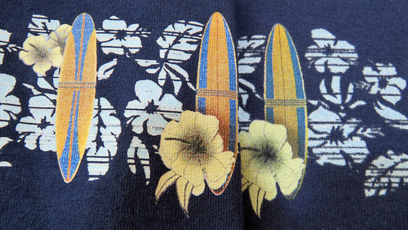
Let's compare the surfboards. here is the Cafepress version put up against the Zazzle version. The Cafepress surfboard seems to have cleaner edges and more depth of color, to my eye at least.
Also, I forgot to add in the text to the Zazzle shirt - something else I need to remember next time!
Another surfboard. The Cafepress board (left) looks crisper and has better colors to me that the Zazzle board (right).
Remember, don't compare the blue leaves as I modified them between shirts.
An even closer closeup of those boards.
Yet another board, with same results. Also, I changed the relationship between yellow flowers and boards slightly, that is not a difference in the printing companies.
Another look at it.
Yet another board.
To me, I'm going to use Cafepress over Zazzle whenever my design is 10" wide or narrower. But if I need the width, I'm going to have to go with Zazzle for right now.
I'm also going to try two other companies here shortly, I'll report back on them also.