When I was in my 20s I had a t-shirt I really liked. It was a horse head in sort of a Steve Miller style, in a wooden circle frame that had pegs on the frame. The shirt became old and tattered and eventually I used it to hold the driver's seat together on my very old car. It was still on there when I sold the car.
So I decided to create my own version of the shirt this year, from memory, drawing every line myself and improving the design to be more my taste. And picking a better shirt color (the original was orange!). I sent the same design to two different custom t-shirt companies, Cafepress (on the left) and Zazzle (on the right).
This is the Cafepress shirt. Since CP will only allow designs 10" wide, I downsized the design slightly to fit in 10" and added a bit of yellow to the circle. I think Cafepress did a great job with it.
This is the shirt I received from Zazzle. Even though the original design I sent in was 11.5" and the max size they allow is 14", it came back at 9.5"! Not sure if somehow I downsized it when in their design tool, or just why it was downsized. But the design is a half-inch smaller than the CP shirt.
A little closer view of the CP shirt. The horse is very white and the design is smooth to the touch.
A little closer view of the Zazzle shirt. The horse is a light gray and the design is very rough to the touch. Still looks cool, wish I would have added yellow to the circle on this one, too.
Close up of a random area on the CP shirt. Very nice details.
Close up on the same random area on the Zazzle shirt. To my eye, there is less contrast on this shirt. The blacks aren't as black.
An even closer close-up on the Cafepress shirt. Nice gradients in the shades.
An even closer close-up on the Zazzle shirt. Definitely a rough texture.
I put the two shirts right up against each other.
Detail towards the bottom.
Detail of the horse head really shows how white the Cafepress horse is versus the grayer and rougher Zazzle horse.
The fine print on the Cafepress shirt.
The fine print on the Zazzle shirt looks better to my eye.
Cafepress eye.
Zazzle eye.
Which shirt is better depends on your tastes, I guess. But there are clear differences between the shirts.
Sunday, January 29, 2017
Saturday, January 21, 2017
Cafepress versus Zazzle custom t-shirt comparison
Frustrated at not being able to find what I want in t-shirt designs, I've started to make my own. So far I've used Cafepress and Zazzle to make the shirts. Cafepress is a little more expensive and takes more processing time - Zazzle costs less and arrives faster.
In the photo to the right, the Cafepress shirt is on the left and the Zazzle shirt is on the right. I've already worn and washed the Cafepress shirt in this photo (which explains the wrinkles) while the Zazzle shirt is straight out of the mailbox.
You'll notice that the design on the Cafepress shirt is narrower. I ordered that shirt first and did not realize that their maximum width (10") does not go entirely across the front of the shirt. This is unfortunate as that is what I wanted.
So I widened the design by adding more leaves and spreading the surfboards out more and sent it off to Zazzle, which allows up to 14" wide designs on their shirts. I received the shirt on the right from Zazzle. Not entirely happy with my design yet, as spreading out the surfboards exposed blank spots between the leaves. I'll fix that if I have another shirt of this style made.
Other changes I made: I changed the color and fuzz level of the blue leaves, I used the exact same surfboards and yellow flowers on both shirts, so we should be able to compare those elements directly. Let's do it!
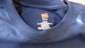
Cafepress uses Haynes shirts. I ordered a large.
Zazzle uses the same Haynes shirts! I ordered a medium.
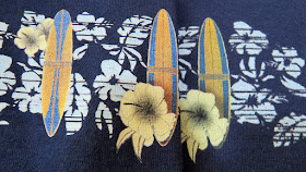
Let's compare the surfboards. here is the Cafepress version put up against the Zazzle version. The Cafepress surfboard seems to have cleaner edges and more depth of color, to my eye at least.
Also, I forgot to add in the text to the Zazzle shirt - something else I need to remember next time!
Another surfboard. The Cafepress board (left) looks crisper and has better colors to me that the Zazzle board (right).
Remember, don't compare the blue leaves as I modified them between shirts.
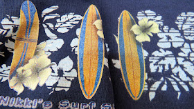
An even closer closeup of those boards.
Yet another board, with same results. Also, I changed the relationship between yellow flowers and boards slightly, that is not a difference in the printing companies.
Another look at it.
Yet another board.
To me, I'm going to use Cafepress over Zazzle whenever my design is 10" wide or narrower. But if I need the width, I'm going to have to go with Zazzle for right now.
I'm also going to try two other companies here shortly, I'll report back on them also.


